Milnuevediez Wayfinding System
A signage system that embraces both the raw and the refined, with precision and clarity.
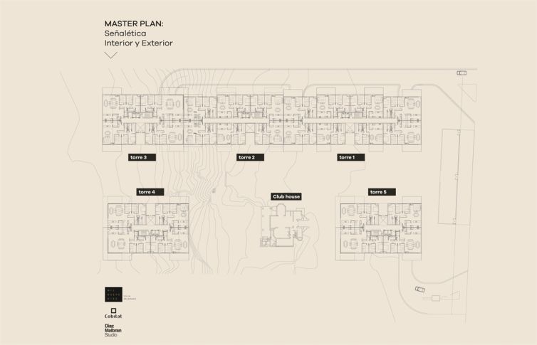
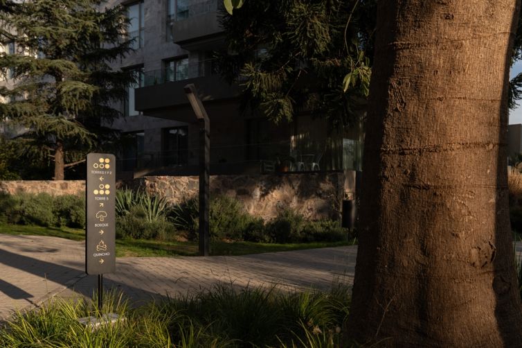
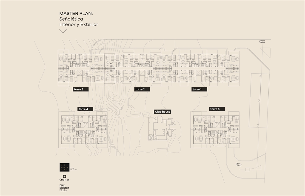
The wayfinding system for Milnuevediez was designed as an integral intervention, guiding residents and visitors from the complex entrance to the common areas inside. The system unfolds across two main areas: permanent exterior signage (directional, locational, regulatory) and interior signage for towers, lobbies, and individual units.
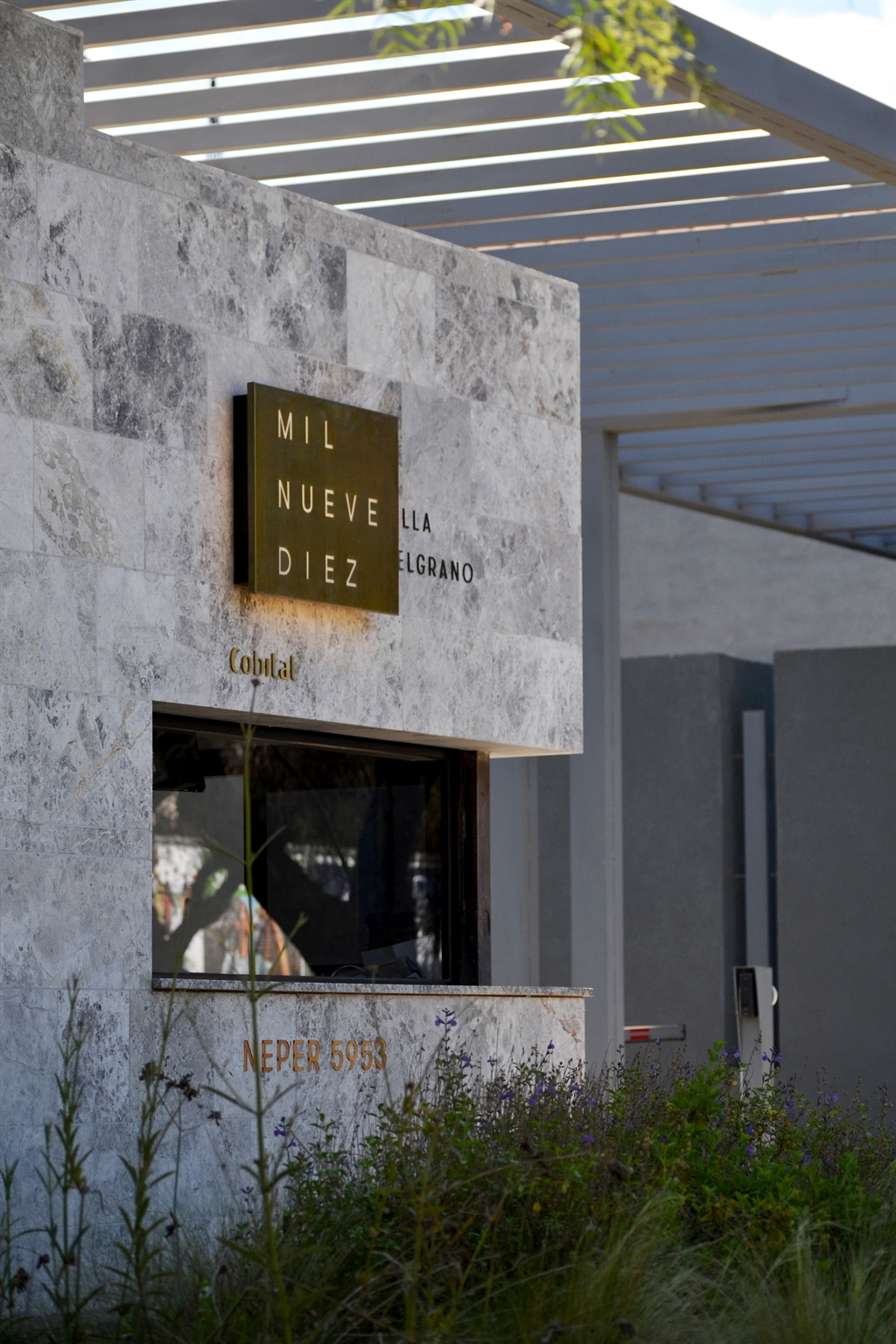
Its formal language takes cues from the architectural materials: Tundra Grey stone and wood — noble, raw, yet refined. In tune with them, we designed supports and graphics that don’t compete but rather enhance the character of the place.
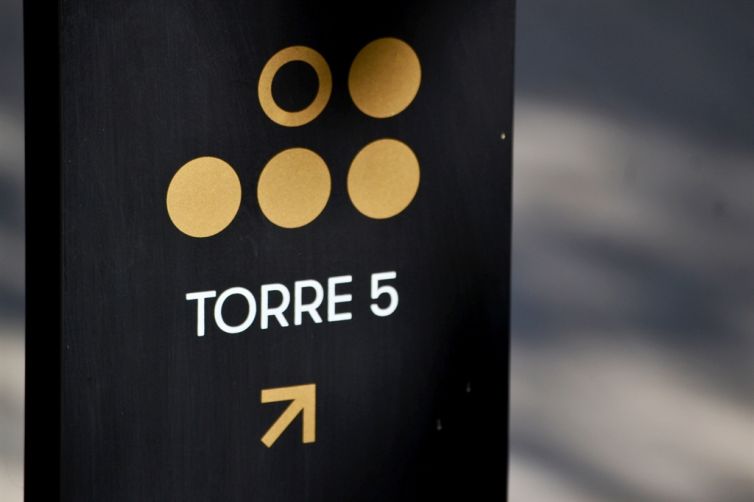
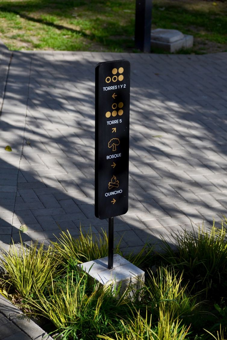
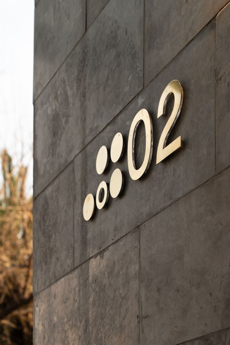
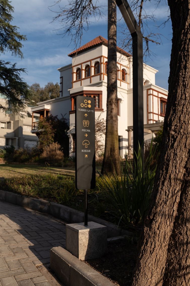
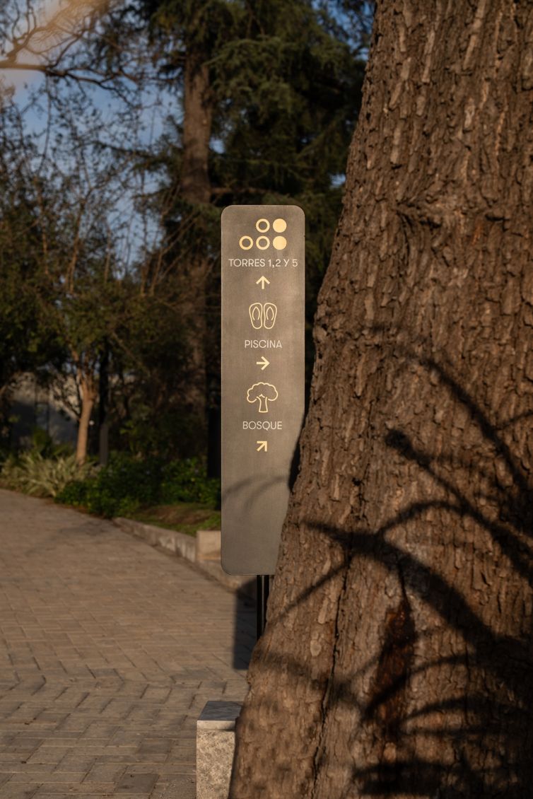
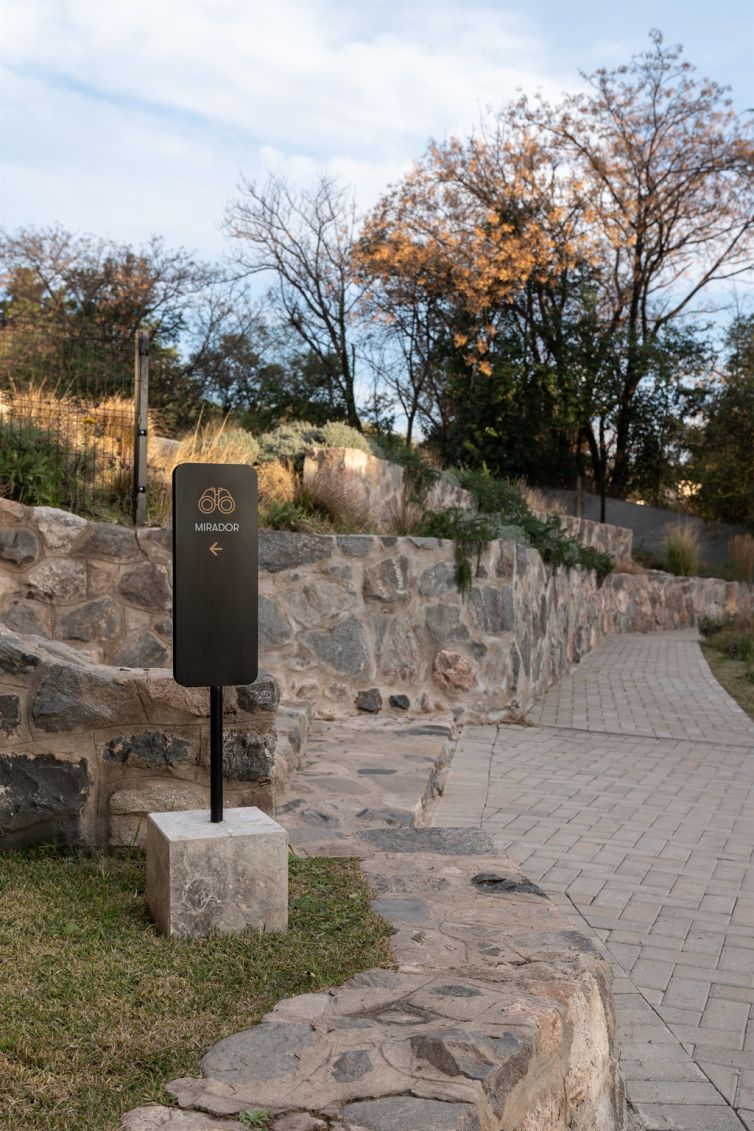
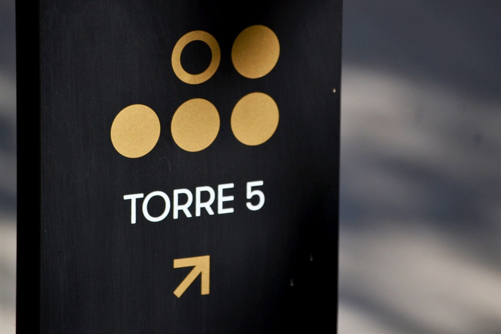
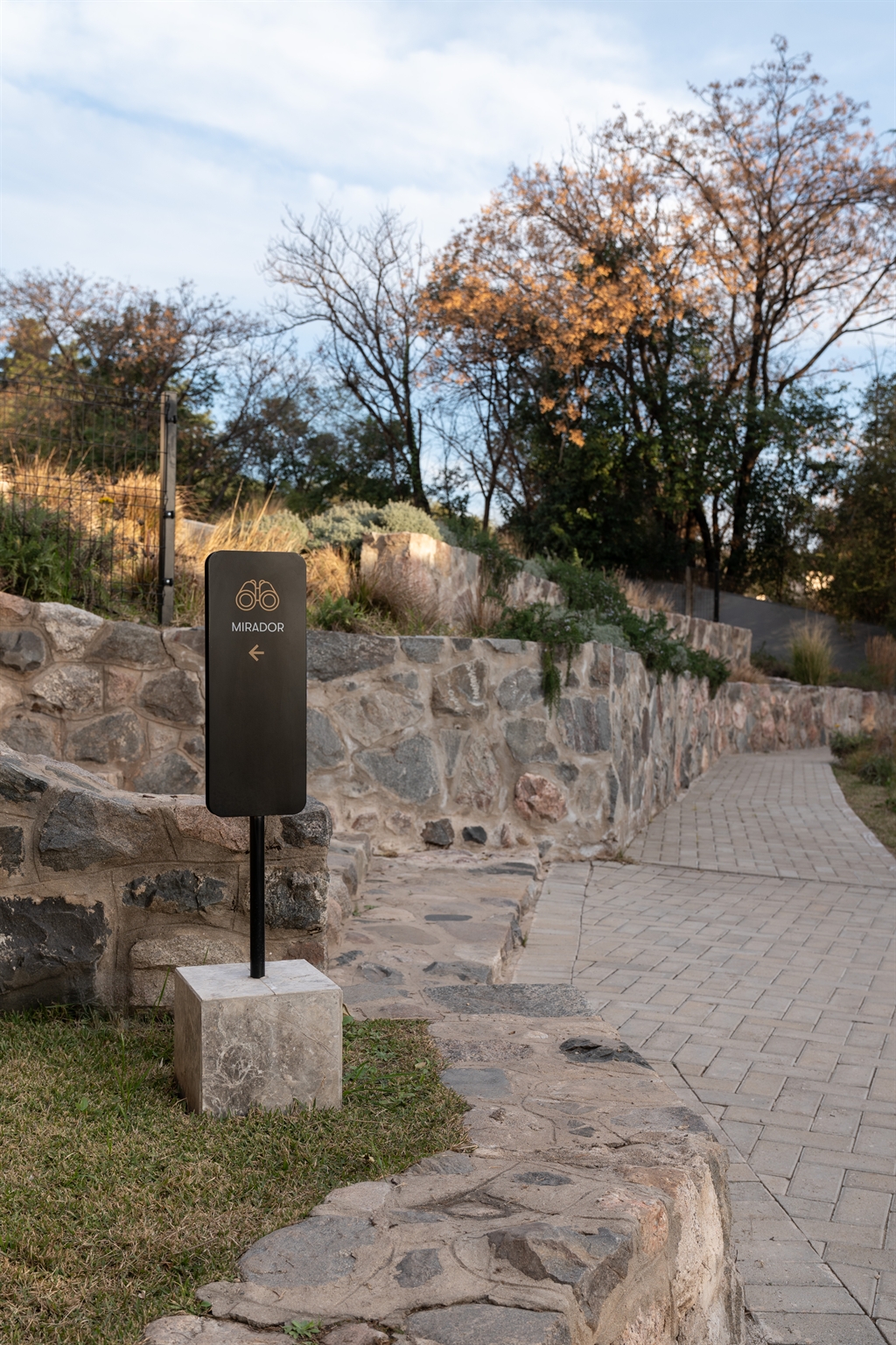
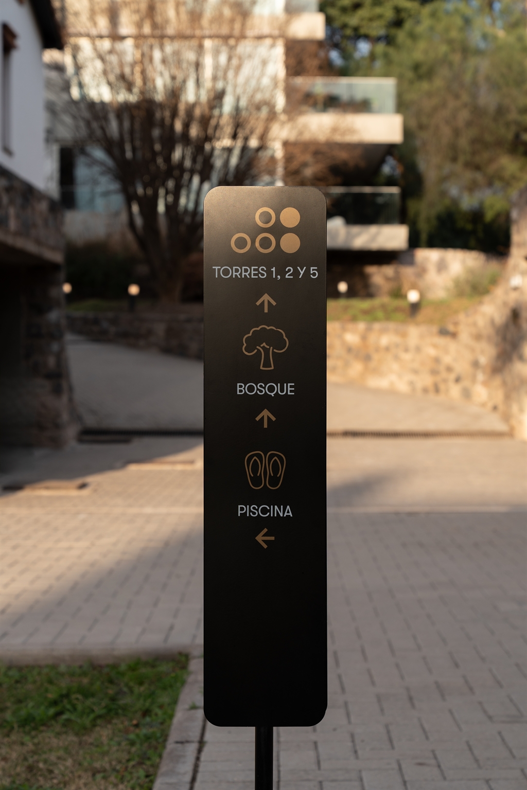
Exterior: firm yet flexible
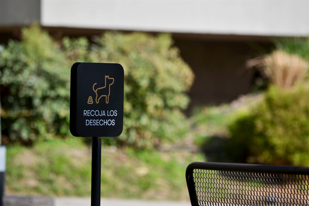
The outdoor totems feature a stone-clad cubic base topped with a matte black lacquered metal plate, double-sided for visibility. This surface hosts engraved golden icons and directions, using custom type and pictograms. The result is a firm yet mobile piece that can be repositioned as needed — like discreet buoys that mark what matters: towers, forest, pool, barbecue area, or community rules like pet etiquette.
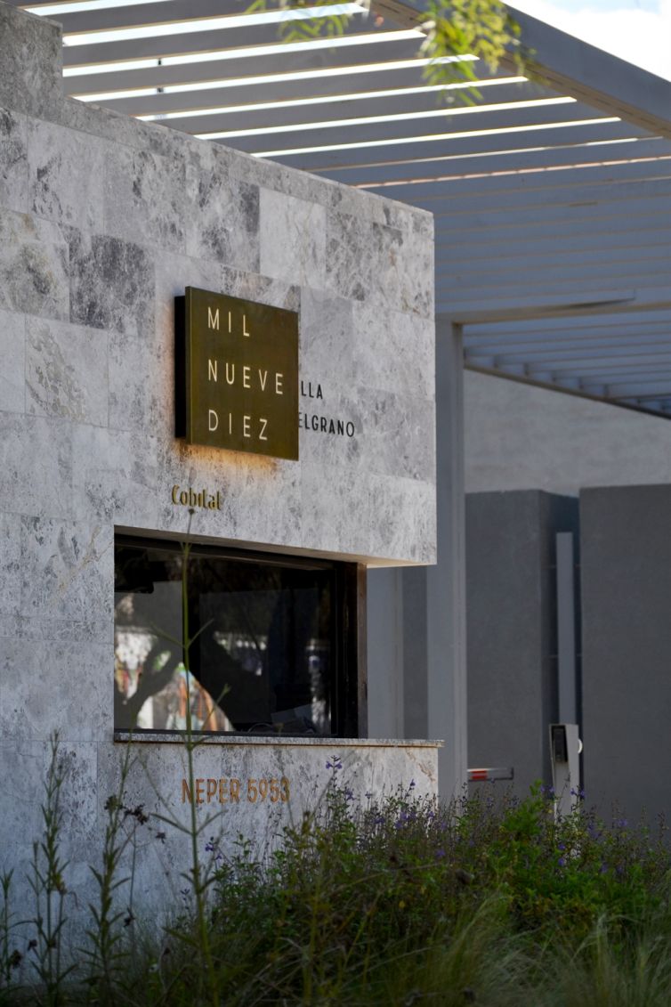
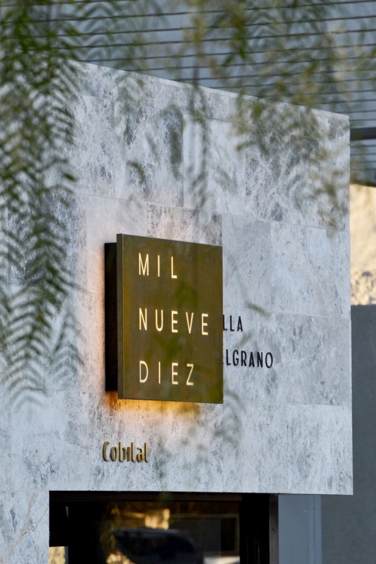
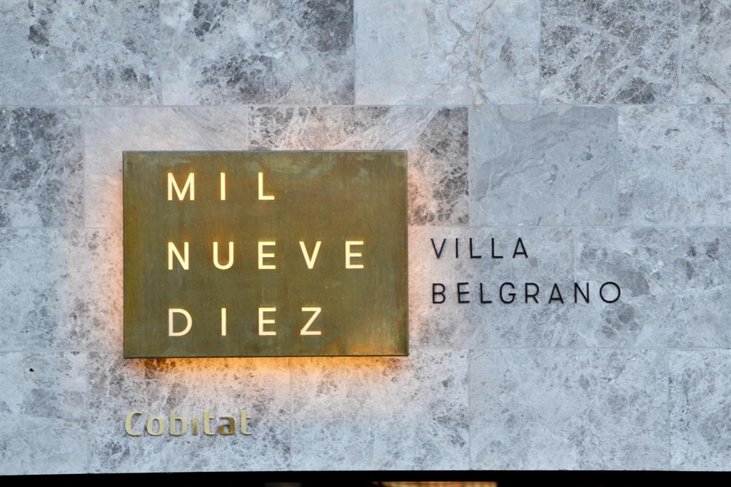
At the main entrance, a cut-out bronze sheet with backlighting signals the access point, adding lasting visibility and a timeless touch of exclusivity.
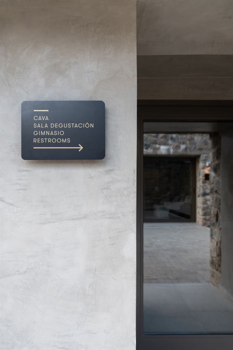
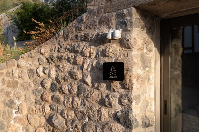
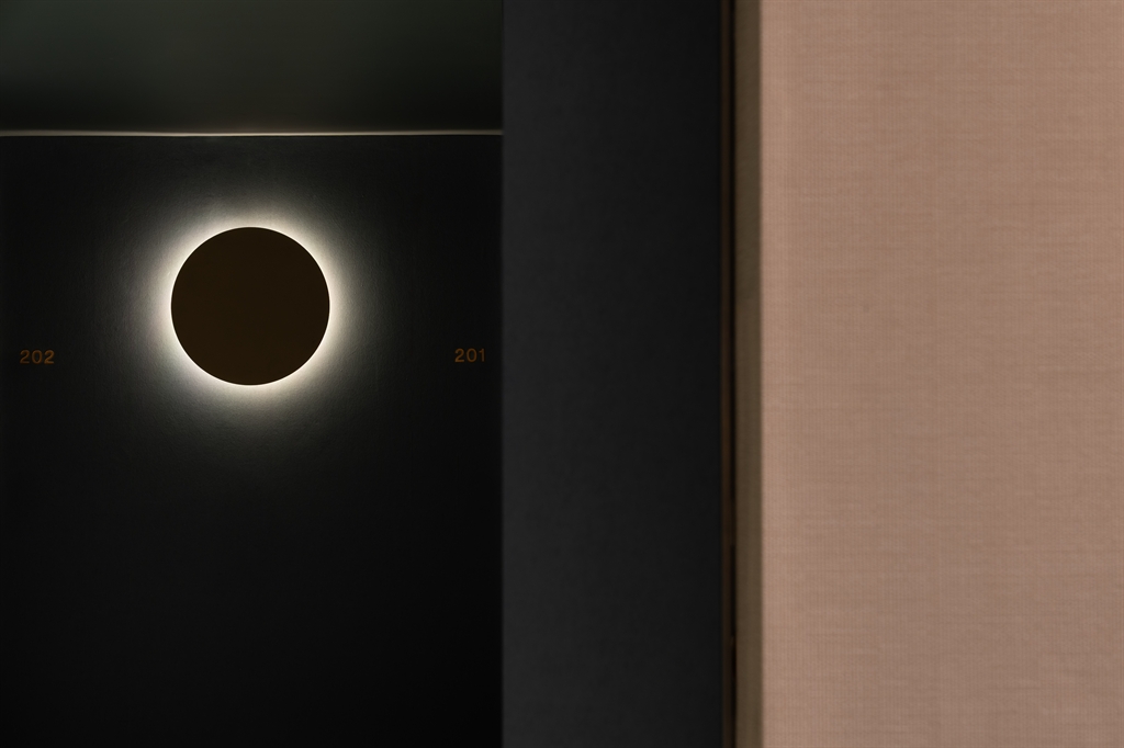
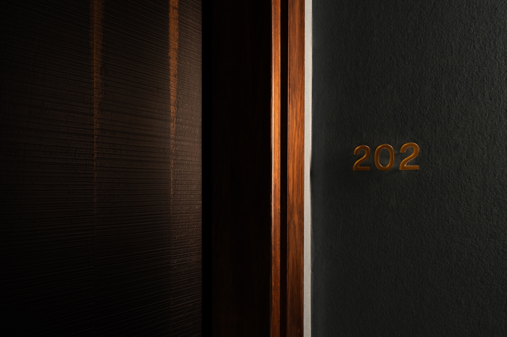
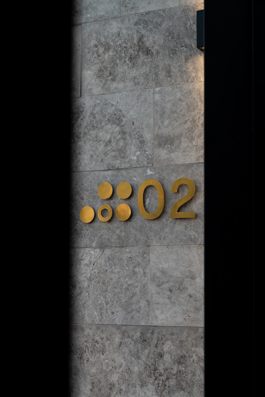
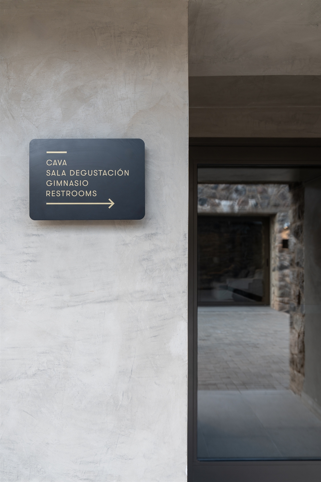
Interior: bronze, contrast, and depth
Indoors, signage responds to the deep blue wallpapered walls and comes in layered expressions:
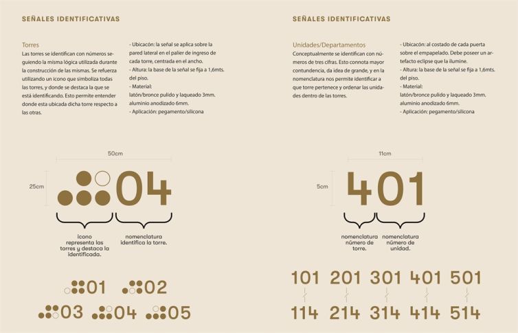
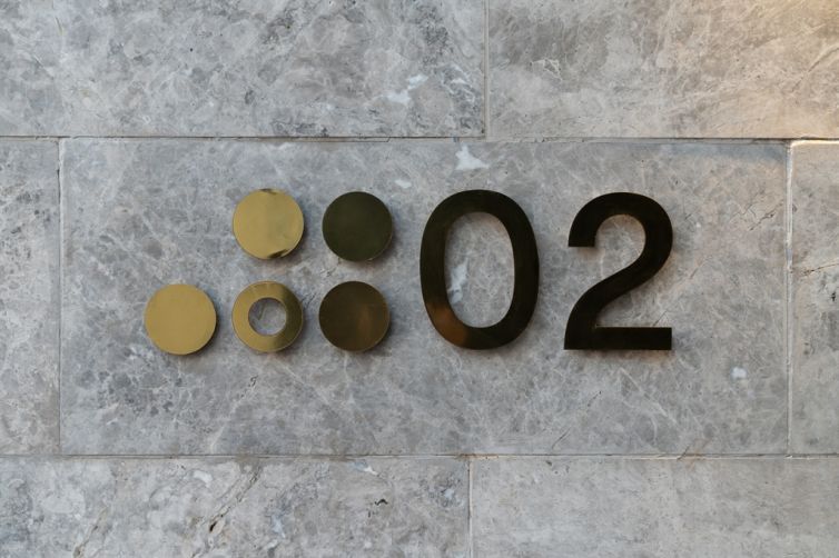
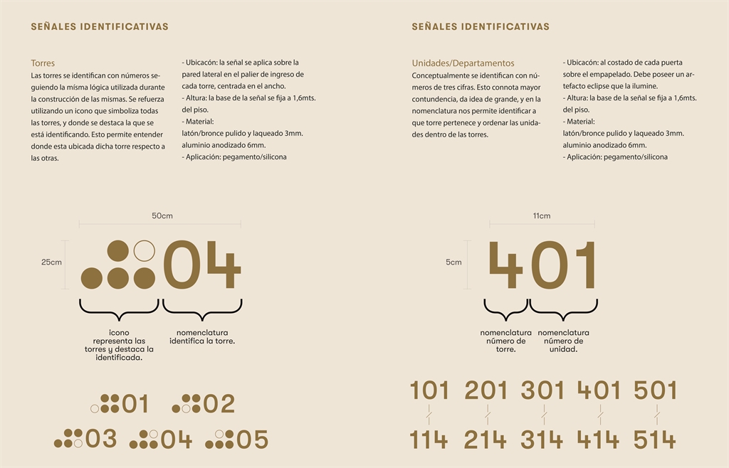
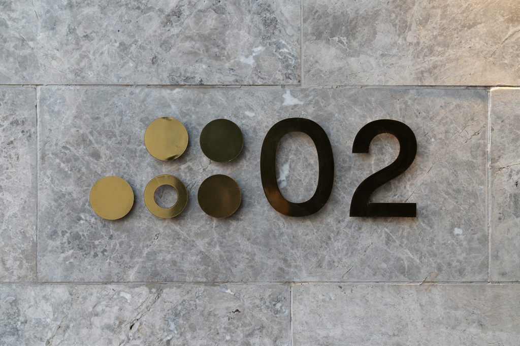
- At each tower entrance, numbers and identifying icons are made of polished bronze, enhancing contrast with the stone language outside.
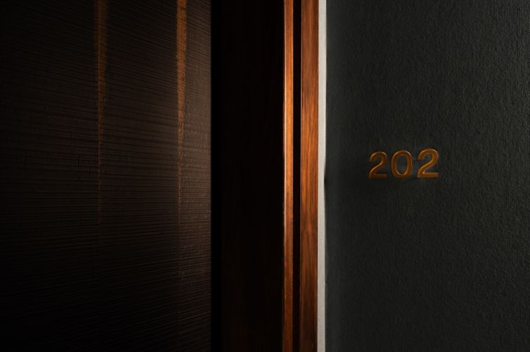
- In hallways and lobbies, unit numbers are produced in 5mm acrylic, back-painted in bronze tones to create depth and detail. A three-digit format (e.g., “202”) strengthens legibility and ties into residential numbering logic.
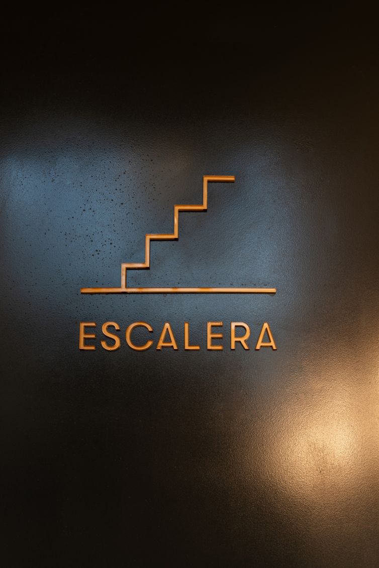
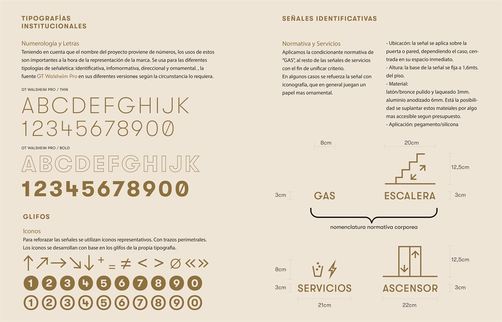
- For communal spaces (stairs, elevator, services), we implemented a more iconic system, combining clear symbols with universal typographic cues.
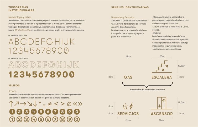
Graphic system
The typographic base is GT Walsheim Pro in Thin and Bold weights, used hierarchically. The icons, designed from the same glyph language, reinforce each sign’s message without redundancy. The whole system aims for clarity, synthesis, and visual harmony.
CLIENT: Cobitat
WWW: Cobitat


